CASE STUDY · 0 → 1 INTERNAL PLATFORM
Team Rubicon Operations Platform
A 0 → 1 internal platform that unified disaster-response logistics for 1,000+ volunteer leaders — replacing five fragmented tools with one situational-awareness home.
ROLE
Sole Product Designer
Led research, IA, and visual design
Drove stakeholder alignment & deferral memo
Partnered with eng on component library
TEAM
1 Product Designer (Me)
1 Engineering Lead
1 Product Manager
COMPANY
Team Rubicon
TOOLS
Figma, FigJam, Miro, Maze
DURATION
3 months, Summer 2024
IMPACT I BROUGHT
Single situational-awareness surface
Faster field decisions under pressure
Shared component library for adjacent tools
5 → 1
TOOLS CONSOLIDATED
Spreadsheets, email, group texts, and 2 internal apps unified into one surface.
-42%
MEDIAN TASK TIME
Reduction across the top three field tasks in moderated usability tests (n=12).
1,000+
VOLUNTEER LEADERS SERVED
Active field leadership across regional chapters at launch.
The Problem
Fragmented tooling under pressure stems from spreadsheets, group texts, and legacy apps that fracture situational awareness — exactly when speed is the job.
"I had to call someone just to figure out which team I was on."
— Volunteer Leader, NY
"There are too many tools. I wish everything was in one place."
— Operations Lead, LA
"By the time I figure out where the latest update lives, the moment's already passed."
— Regional Coordinator, FL
Challenge #1
Inefficient workflows fracture situational awareness
Challenge #2
Insufficient communication between field & ops
Challenge #3
Legacy tools can't scale to new disaster contexts
The Solution
Build a focused command surface — one situational-awareness home where personnel, work orders, equipment, and weather are read-first, and advanced flows are progressively revealed.
THE TRADEOFF THAT DEFINED THE PROJECT
Build a focused command surface — at the cost of feature parity with legacy tools.
OPTION A — PORT EVERY FEATURE
Rejected
Recreate the four tools' surface area in one app.
PROS
No retraining cost. Stakeholder confidence: 'nothing's lost'.
CONS
Replicates the legacy mental model that caused the problem. 3 months → 12 months. Defeats the goal of reducing cognitive load.
OPTION B — FOCUSED COMMAND SURFACE
Chosen
Ship one new home screen designed for situational awareness; expose advanced flows progressively.
PROS
Forces real prioritization: what matters in the first 60 seconds? Ships in three months. New volunteers productive immediately; veterans keep their depth.
CONS
Requires stakeholder buy-in to leave some legacy features for later. Requires a clear story for what's deferred and why.
RATIONALE
We picked B and wrote a one-page deferral memo for stakeholders, listing every legacy feature with a 'now / next / not soon' classification. That memo did more for buy-in than any prototype.
Process
Collaborating with engineering and operations leadership, I audited five legacy tools, ran nine field interviews, and rebuilt the IA around what leaders check first. UI kits, component standards, and progressive flows shipped together.
What We Shipped
01
Situational awareness, in one glance
The home screen surfaces the four things a leader checks first: personnel status, work order progress, equipment availability, and weather + map. Numbers are read-first; details are one tap away.

02
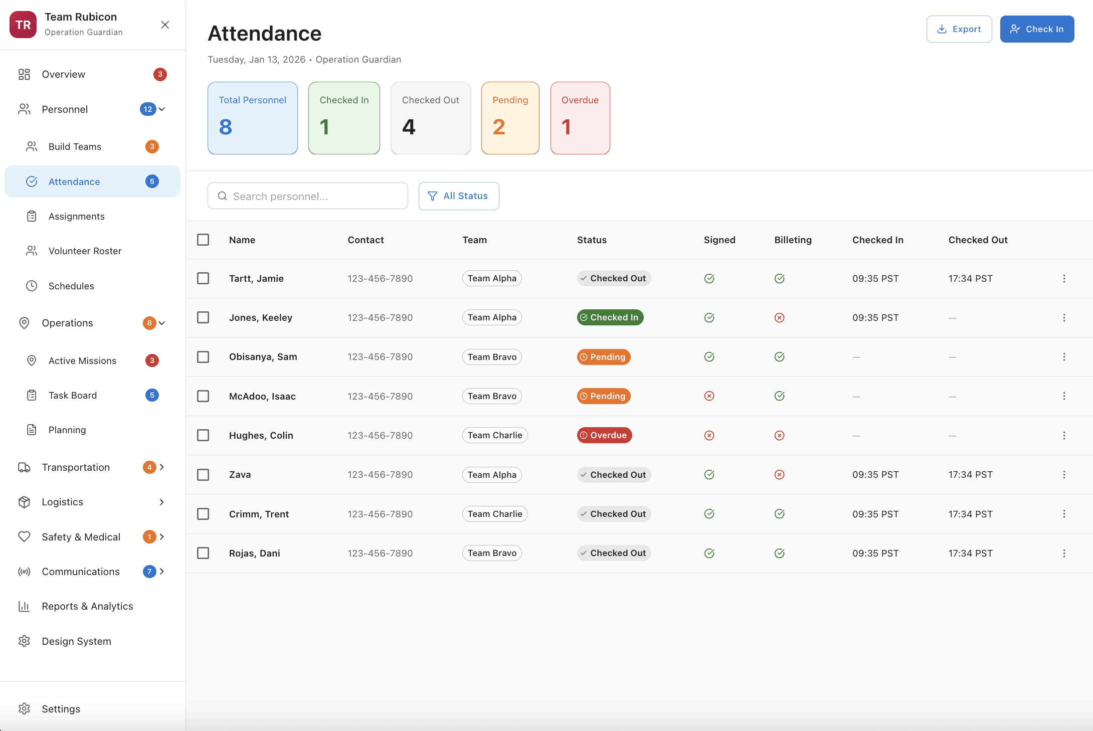
Attendance that closes itself
Check-in/check-out sits where it's used, with timestamps captured automatically. Signature is optional, not gating. The flow takes 3 seconds per volunteer instead of 30 in the spreadsheet.
03
Transport tied to mission data
Flight arrivals, driver dispatch, and team movement live alongside the operation. Color tags map to real-world states so a leader can scan a table and act.
Screenshot placeholder
Screenshot placeholder
04
Announcements with live preview
Composing a downtime or session notice shows the rendered card as you type. Edit and delete share one entry point, opened from the card itself.
Outcome
What used to require a mix of texts, spreadsheets, and repeated check-ins now happens in one system. In moderated testing, median time on the three most common field tasks dropped 42%. Clarification requests — calls and texts asking 'who am I assigned to' — fell measurably in pilot regions.
Internal stakeholders aligned on a roadmap for the deferred legacy features. The shared component library shipped alongside the platform now anchors three downstream surfaces.
"
"I open it once and I know the operation. That's the whole job."
Volunteer leader, pilot
"
"First tool we've used where the design wasn't the bottleneck."
Operations lead
Reflection
Designing for disaster response means designing for pressure. In those moments, even small interaction issues become blockers — clarity isn't a UX goal, it's a form of support.
If I were starting again, I'd run the deferral memo earlier. The biggest unlock wasn't a screen; it was getting stakeholders to agree on what we weren't shipping yet.