01
Project Overview
DISCRIPTION
The Merchant's House Museum website redesign involved a comprehensive effort to enhance the site's usability and visual appeal, aimed at attracting a younger audience. A team of UX designers executed the redesign, focusing on streamlining navigation and improving the ticket purchasing process.
Conducted over three months, the project included phases of user research, tree testing, card sorting, survey design, prototyping, and user testing to ensure the new design met the expectations and needs of potential visitors.
Optimizing Merchant’s House Museum’s ticket purchasing and trip planning experience
Redesigning the website’s Information Architecture for a more attractive ticket purchase and trip planning experience to acquire younger visitors
02
Design process
Research
Problem And Solution Statement
Competitive Analysis
User Persona
Implementation
Design System
Idea brainstorming
User Flow
Finalising
High Fidelity Wireframe
Low Fidelity Wireframe
Final UI
Ideate
Turn idea from concept and brainstorm to MVP
Wireframe
Sketch out the product to align the user needs
Design
Draw the designs for final look and feel
Hand off
After finalizing, I'll review and then present the case study to the client.
Preparation
DESIGN PROCESS
03
Empathise
To attract a younger demographic, the redesign of the Merchant's House Museum website focused on enhancing usability and visual appeal to attract a younger audience.
It addresses key user pain points identified through research—such as difficulties in accessing event schedules, exhibition details, and visitor guidelines—by streamlining navigation and optimizing the ticket purchasing process.
The redesign prioritizes making museum offerings more accessible and engaging, thereby aligning the website with the expectations of younger visitors
Solution Statement
Research
Users find it frustrating when it’s hard to find information on website
To understand the user needs and pain points when it comes to visiting a museum, we screened for users in the target age range and who have visited museums before, and conducted a total of 8 interviews.

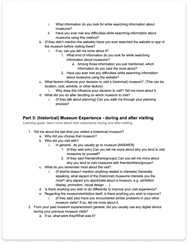
We then utilized affinity diagramming to analyze our collected data, identifying common patterns regarding what motivates visits, what users seek on the museum website, and the challenges they face during their interactions.
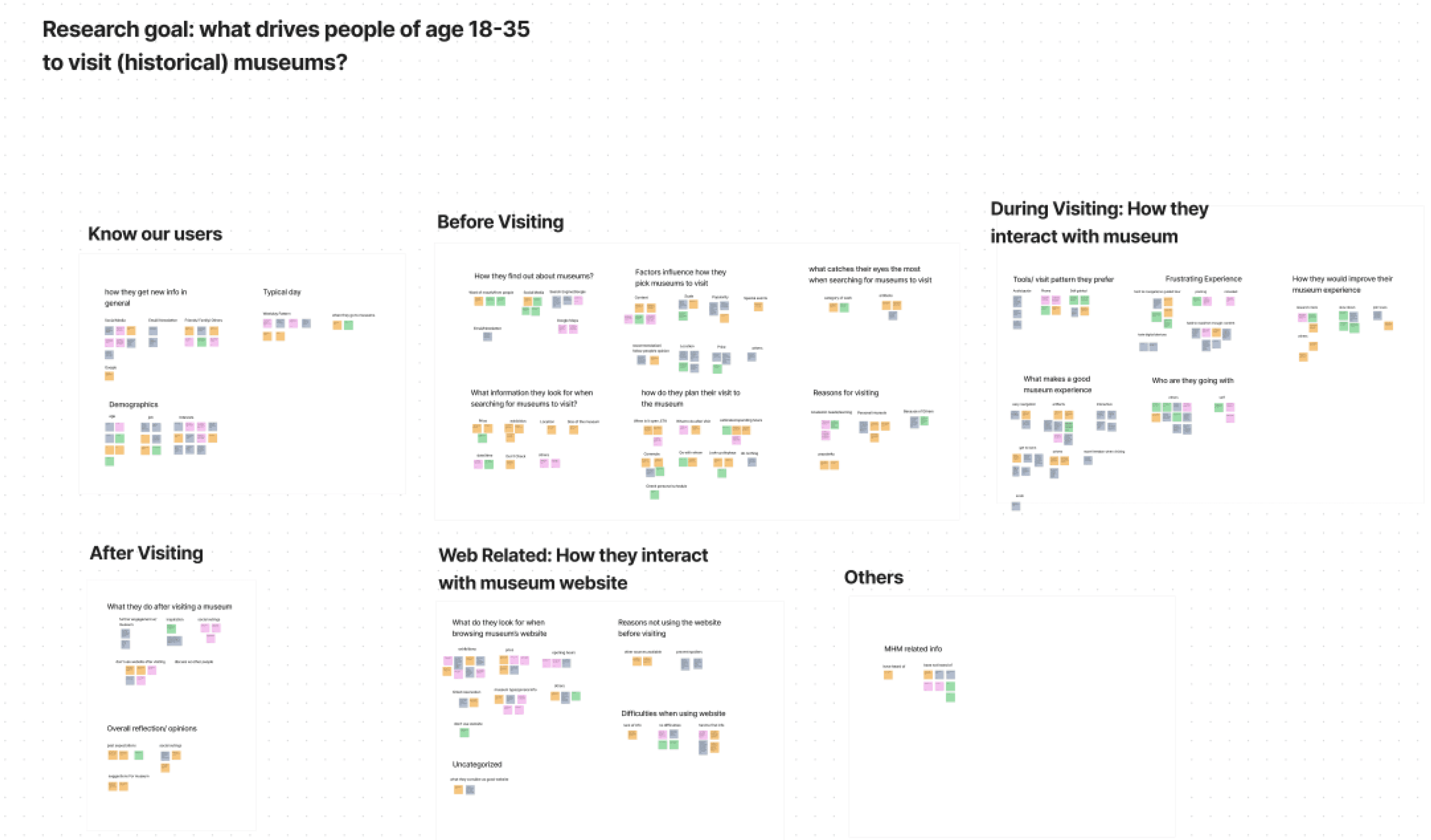
Here are some key insights we found:
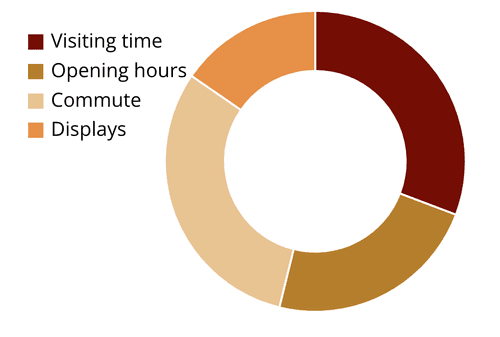
01.
Users take into consideration visiting time, commute, and opening hours when planning their visit.
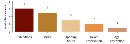
02.
Users look for exhibitions/content of the museum, and price/ticket registration when browsing website.
03.
Users find it frustrating to use a museum’s website when it’s hard to find information and requires a lot of mental effort.
When I wanna find details about upcoming seasonal exhibitions, I often find that this information was not prominently featured on the museum's website. It sometimes required a lot of digging to locate such details.”
-Interviewee Maryam
Help our clients empathize with users through persona
I created a persona to help our clients understand users’ behaviors and struggles.
Zoe Williamson

Age
23
Occupation
Student
Location
Jersey City, NJ
TEch literate
High
Bio
A 23-year-old violinist with a passion for music, art, and history, Zoe's dedication to mastering the violin has not only honed her musical skills but also granted her a unique perspective on the world of art and culture. She has deep appreciation for the arts.
Zoe immerses herself in inspiring exhibits at art and historical museums, finding inspiration for her creative journey.
Behaviors
•
Enjoys solo and group visits to museums.
•
Prioritizes exhibition information when deciding on visits.
•
Carefully plans museum outings considering logistics.
Needs & Wants
•
Needs a balance between academic responsibilities and social life.
•
Wants to explore a diverse range of museums in leisure time.
•
Wants to create enjoyable museum-going experiences.
•
Wants to gain new insights from each museum visit.
Daily Routine
•
Weekdays are filled with academic work.
•
Weekends are dedicated to social interactions and family time.
Museums are fascinating; they offer a diverse range of exhibits that I wouldn't typically encounter in my daily life. Visiting a museum is a uniquely enriching experience.
Frustrations
•
Struggles with finding specific museum information online.
•
Disappointed when museums don’t match up to recommendations.
•
Unsatisfied when museum visits lack comprehensive information.
•
Wants to gain new insights from each museum visit.
04
Define
Refining our design goal
After conducting our user interview, we found that the ultimate goal for users to interact with a website is to learn what the museum is about, plan their trip, and purchase tickets. We decided to tackle these issues for the scope of this project, and thus refined our design goal to be:
How do we reach and engage with audiences between the ages of 18 and 35 by redesigning the website’s information architecture to make it easier and more enjoyable for users to plan their trips and purchase tickets?
Learning how 8 other competitors solve user needs
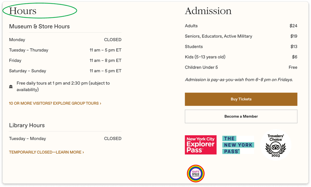
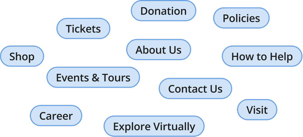
After getting a grasp of our users, we conducted a competitive analysis to gain insights into how other museums solve these user needs. We analyzed these standard dimensions of the websites:
The Met
MoMA
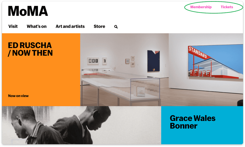
New York Historical Society
Museum & Library
CARD SORTING + TREE TESTING
Shaping the content by redesigning the Information Architecture
Method 1: Card sorting
helps us to understand user’s mental models and how they would group contents of the website.
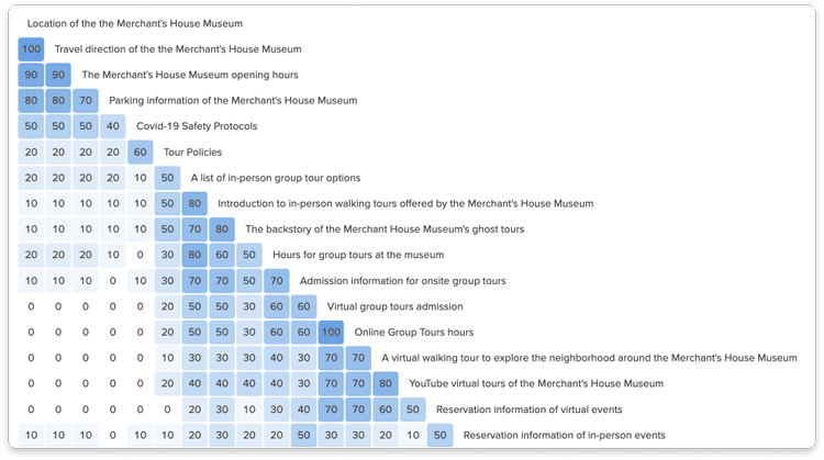
We used a similarity matrix to learn how users correlate/group each card based on how often items are grouped together in the card sorting.
Method 2: Tree testing
helps our team to evaluate how well our newly proposed Information Architecture has matched user’s mental models.
What we did:
Rename “Event Ticket” to “Ticket Admission” that includes general admission, event ticket admission, and tour admission instead of event ticket admission only.
Since users mentioned the importance of being able to find information easily, we started the redesign by first organizing the existing contents of the museum’s website in a way that’s intuitive for users. We used below 2 methods to do this:
Overall, these 2 methods helped us confidently create a site map of the newly structured information architecture that we believe users can easily find their desired actions from.
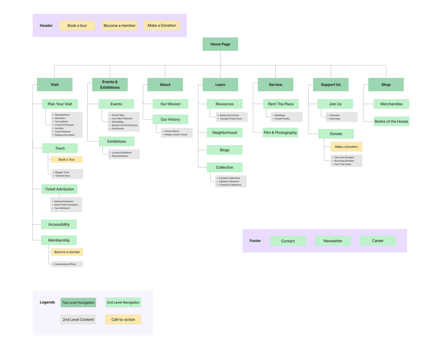
Site map
Site map to visualize the new information architecture
Site map created by me on Figma:
User Story + Task Flow
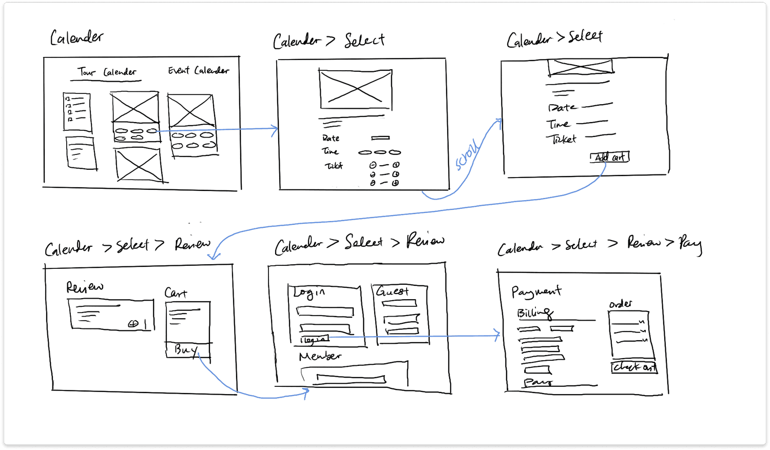
Fulfilling user stories through task flows
After finalizing on our site map, we dived into creating user stories and task flows to lead our prototype. We came into the below user story of a visitor and its 2 task flows:
User Story
As a visitor, I want to plan my visit to the museum and purchase tickets so that I can visit the museum smoothly.
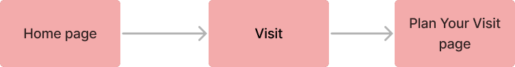
Task flow 1
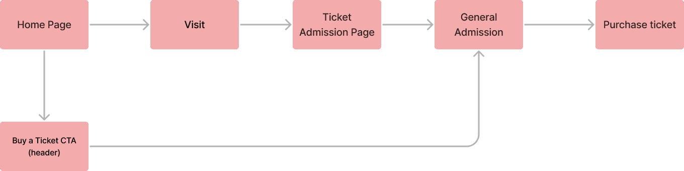
Task flow 2
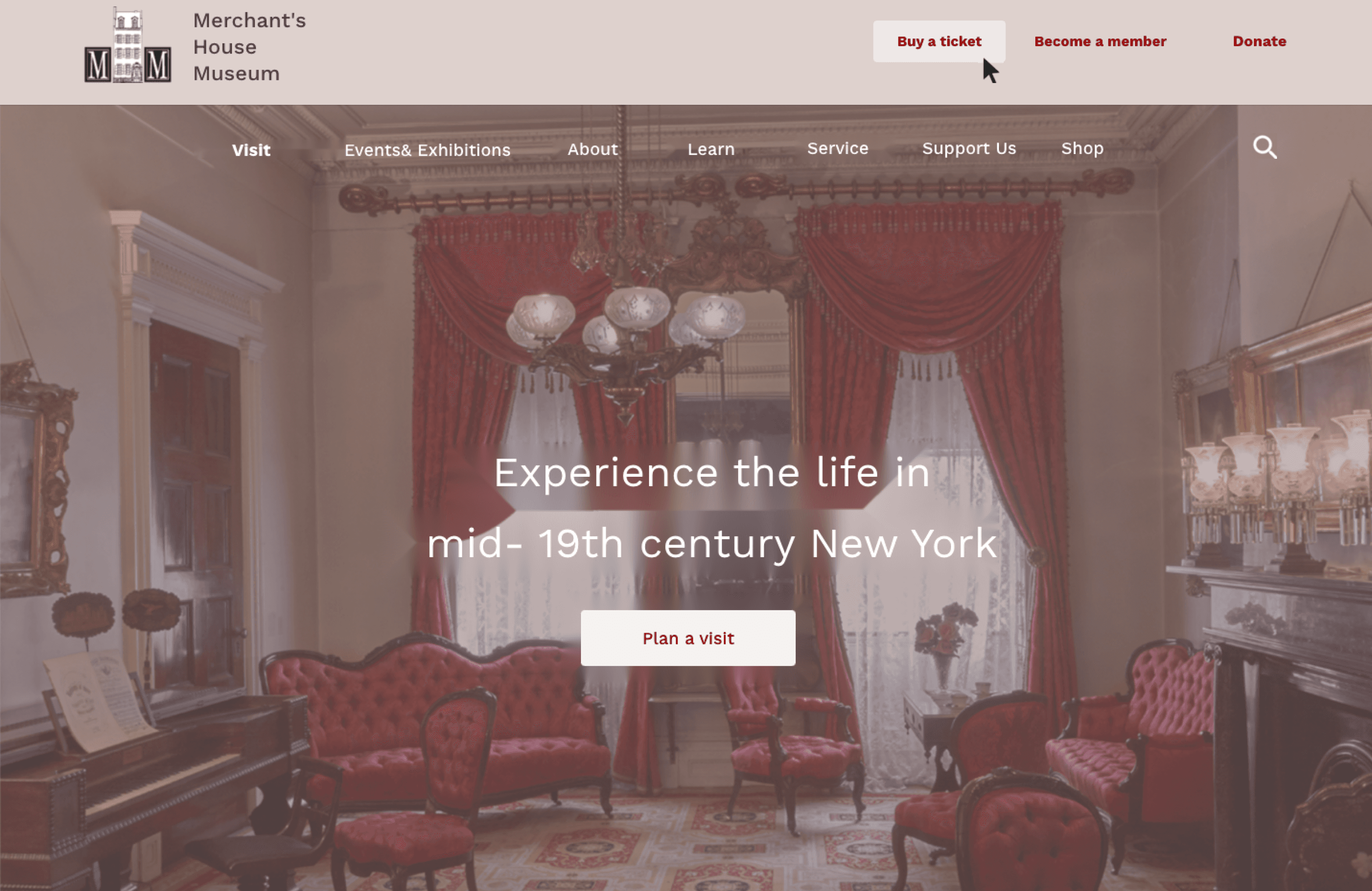
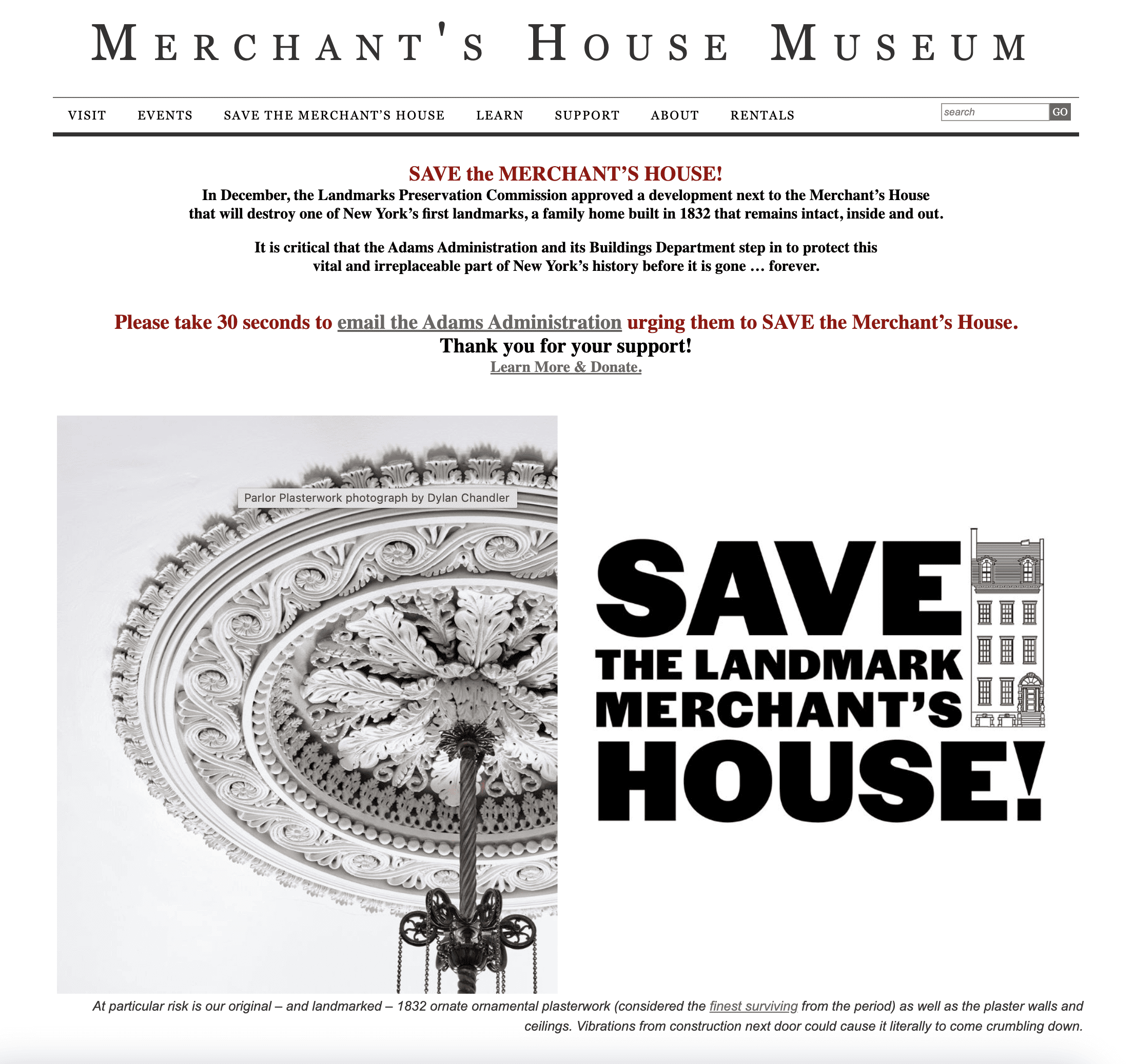
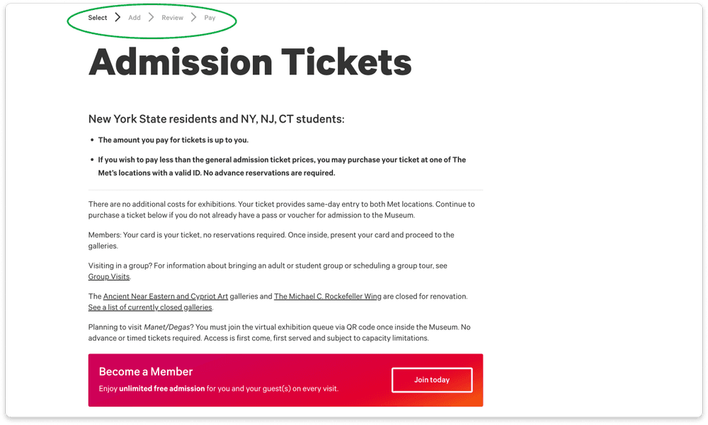
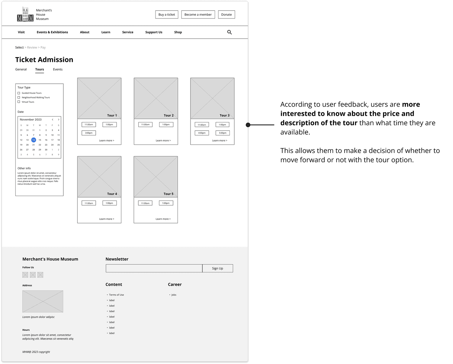
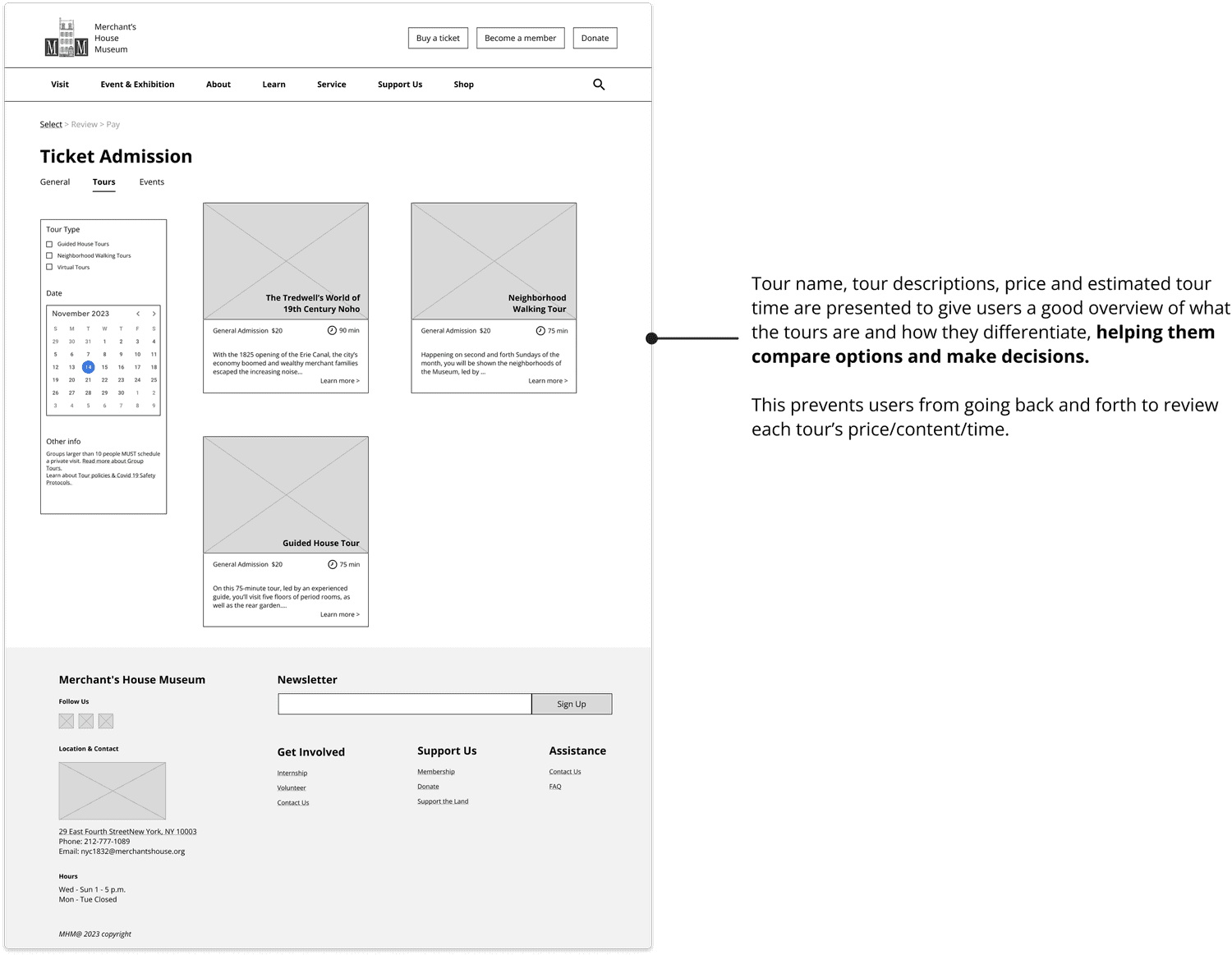
Ticket admission page - Before
After
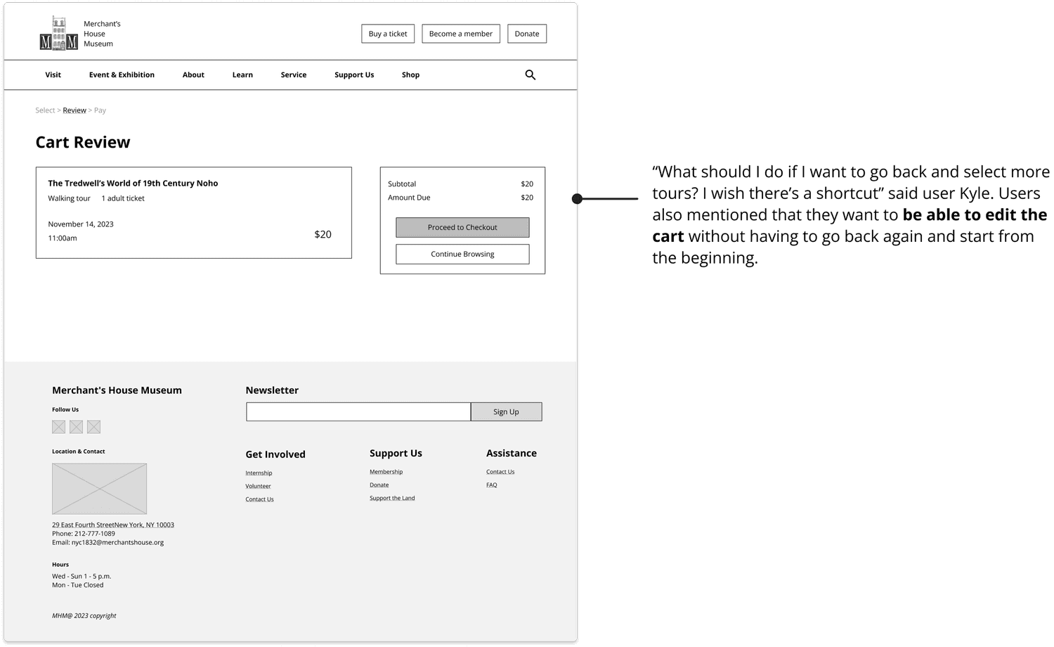
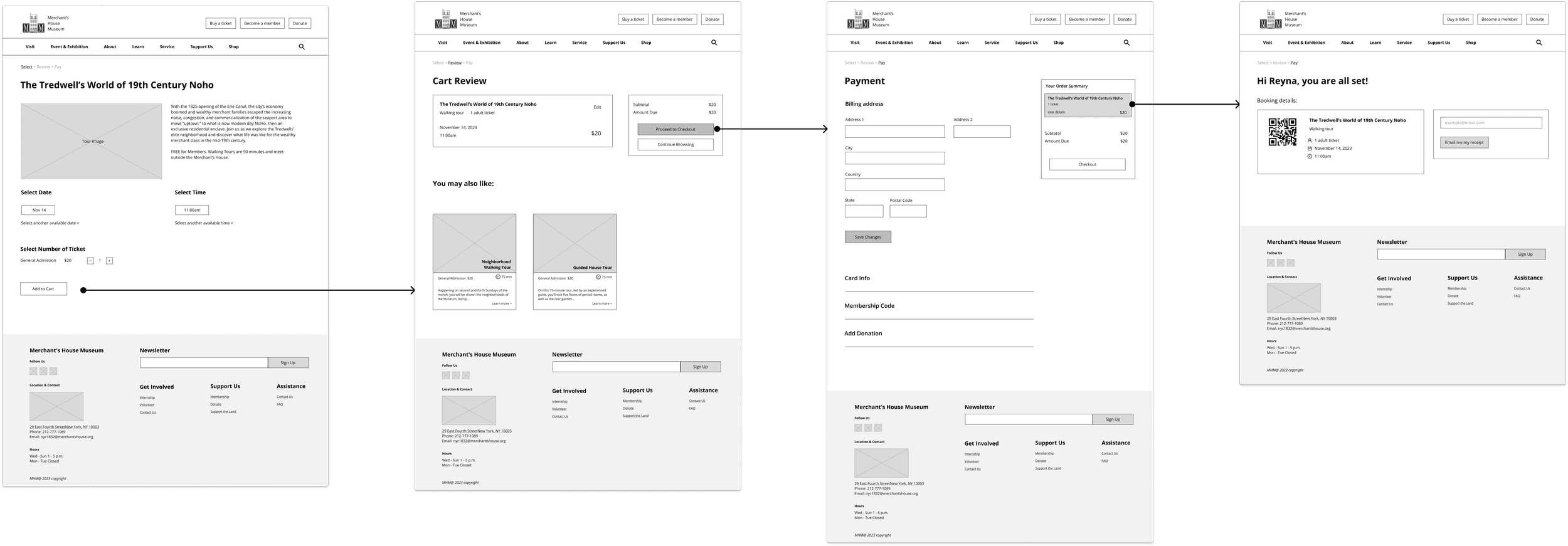
Cart review page - Before
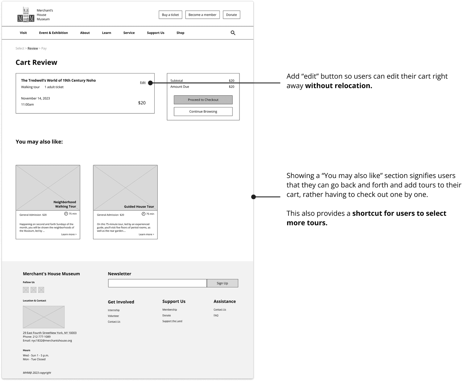
After
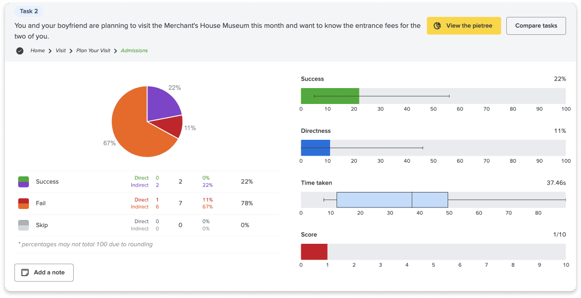
Prototype testing on mid-fidelity
We created mid-fi prototypes based on the wireframes, ensuring the key UI elements and functions are ready for users to interact with and thus provide feedback on. We then conducted prototype testing on 5 users to learn about potential frustrations and ways to improve our designs before moving to high-fi.
The rest of the prototype for ticket purchase task flow
Next steps…
Reach out to our client and present our high-fi prototypes in hopes of getting them developed.
Conducted another round of prototype testing on the high-fi prototype to ensure our usability goals were met. Metrics to measure success can include task completion rate, task success rate, and user satisfaction rate.
High-fi prototype - coming soon!
What I’ve learned
Reflections on My Experience with a High-Performance Team
Working with a high-performance team has been an incredible journey! I was lucky enough to join a group of high achievers for this project, which really opened my eyes to what a top-tier team looks like. We were always on the same page, chatting quickly and transparently. Everyone brought their A-game, staying ahead of tasks and pitching in equally. What stood out most was our shared passion for design and research—everyone was eager to learn more and sharpen their skills. Moreover, this experience took collaboration to another level, teaching me how to integrate diverse skills and perspectives effectively.
Navigating Disagreements in Team Settings
Disagreements are natural in team settings, but I've come to see them as opportunities to encounter fresh ideas and perspectives. It’s crucial, however, to handle these situations delicately by balancing time constraints and the need to prioritize. I've learned the importance of listening to everyone’s views and striving for a consensus. Whether it involves voting or consulting mentors, finding the right approach to agreement is key.
Personal Growth as a Designer
This project was also a milestone for me personally as a designer. I got to try my hand at card sorting and tree testing for the first time, which was not only fun but incredibly insightful. These methods helped me gain a deeper understanding of our users, boosting my confidence in my design abilities.
05
Ideate
Visualizing ideas through wireframing
Now it’s time to visualize the flows! As I’m in charge of the ticket purchase flow, I created wireframes to help visualize my ideas.